Trader Joe's Delivery App
Trader Joe's is known for their specialty products, cheerful crew members, and low prices.
By keeping their stores small and not investing in extras like order and delivery services, they have successfully developed a brand identity around "exclusive" budget friendly shopping. However, we believe that they have missed an opportunity to serve a large part of the community.
** This case study is not affiliated with or endorsed by Trader Joe's.

PROBLEM STATEMENT
By creating a brand identity around exclusivity, Trader Joe's is limiting access to customers who are not physically able to shop in their stores because they do not have an order or delivery service.
The Solution?
By designing a delivery and order pickup app for Trader Joe's,
we believe we can broaden the range of their customers, promote accessibility, and grow the brand to meet modern business expectations.
Role:
I worked in a team with three others to conduct research & form design systems. I took on the navigation & visual design for product information, search categories, & prototyping.
Tools:
Figma, InVision, Miro,
Adobe Illustrator
Timeline:
Three weeks
The Process
Empathize
Ideation
Testing
Iterating
Prototype
Empathize
Survey + Insights + User Persona + Competitor Analysis
Survey Results
We surveyed 171 participants about their experiences using delivery apps and order pickup services.
117 of 171 participants use order and delivery services for their groceries. When asked about store preferences, Trader Joe's tied with Target for the most shopped at store.
Do you use order & delivery apps?
95% said they order online
& pickup in store.
91% use delivery.
How often?
Of these respondents,
41% said they use these
services weekly, 32% monthly.
What prevents you from in store shopping?
46.1%
27.6%
12.5%
7.2%
2.6%
3.9%
Too many people
Time
Location
Someone else shops
Does not drive
Accessibility
Interview Insights
We conducted five interviews with individuals about their experiences with delivery apps and their accessibility needs.
Key Takeaways
-
Interviewees do not like dealing with busy stores, crowded parking lots, or long lines.
-
Shopping is very time consuming.
-
Shopping during a pandemic has been a huge concern, especially for those who are high risk.
-
It's frustrating to make the trip to the store, just to discover they are out of what you need.
-
Location is the main factor in deciding where to shop.
-
Two of our interviewees do not drive.
-
Delivery options promote independence for many people.
It helps me be more independent. I don't have to wait for someone to take me or ask for a ride somewhere.
Affinity Diagram
In Store Experience
Delivery Experience

Accessibility Needs
Key Frustrations:
-
Does not like crowds
-
Location is important
-
Shopping is time consuming
-
Needs to be independent
*Must Have* Features
-
Option to select replacement items in case the item is unavailable.
-
Ability to communicate with the shopper if needed.
-
Easily adjust the quantity or remove items once they are in your cart.
-
Option for in store pickup or delivery.
User Persona
McKenna Miller, is a young individual living in Spokane. She lives with her roommate and works remotely as a data entry assistant. McKenna was born with a multiple sclerosis which can make it difficult to get around and painful to be on her feet for long periods of time. Because of her flare ups and high anxiety, she does not drive.
Great to meetcha,
McKenna Miller
Age: 34
Occupation: Data Entry Assistant
Location: Spokane, WA
Goals & Needs:
-
Enjoys cooking for friends.
-
Needs accessible shopping.
-
Relies on Amazon for essentials.
Pain Points:
-
Cannot walk or stand for long periods of time.
-
Struggles with crowds due to anxiety.
-
Does not drive.
“The very things that hold you down are going to lift you up.” - Timothy Mouse, Dumbo
Favorite hobbies:
photography, reading, and movie trivia


Competitor Analysis
Offers grocery
pickup & delivery
Partners with Amazon
Strong reputation
for quality products
Favors higher
income earners with higher price points

Delivery & in store pickup options
Partnered with many different stores
Same day delivery
Not available everywhere

Local Farmers Markets (indirect)
Fresh & local produce
Supports local community
Products are seasonal & pricing varies
No order or delivery options


Delivery, in store & curbside pickup
Offers a lot of coupons & savings
Reputation for finding (more than) what you need
Some aspects of the app are not user friendly
Ideation
User Flow + User Scenario + Sketches
User Flows
Because Trader Joe's is a company that thrives while keeping their business in house, we thought it was crucial to design both aspects of the delivery app; the customer side and the business side. Below are two user flows, one for the customer and the other for the employees who would be preparing the orders.
KEY

Customer Flow
Employee Flow

Employee Flow

User Scenario
Lets see what McKenna has been up to...

Sketches
Ecommerce apps have a lot to house; product information, multiple ways to search, account information, help with orders. Because of the amount of content the app must provide, we wanted to dive into the information architecture early in our sketches.


Testing
Testing Plan + Wireframes + Feedback
Usability Testing
The Plan:
We tested our prototypes with five different users at each stage of design.
Our main objectives throughout testing were to:
-
Discover users biggest frustrations when using grocery apps.
-
Understand what customers prefer about delivery vs shopping.
-
Identify what helps users fulfill orders quicker & easier.
-
Learn how to design an app that captures Trader Joe's unique in-store shopping experience.
We gave our testers four tasks to complete:
-
Sign in to the Trader Joe's app.
-
Search for Pumpkin Bread and add it to the cart.
-
View a seasonal item and add it to the cart.
-
Check out.
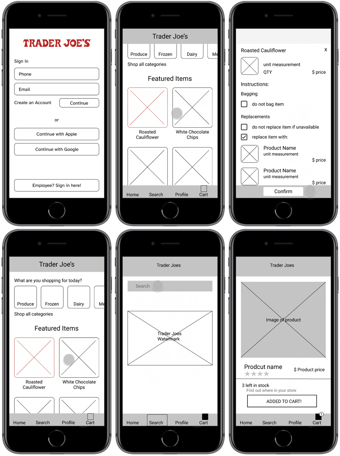
Low Fidelity Wireframes
Customer App


Testing Round One
- Five Testers -
Glow:
-
All users were able to complete the four tasks assigned.
-
Liked the slide up product pages.
-
Liked the order tracking progress screen.
-
Search in nav bar was easy to find.
Grow:
-
Confusion with splash screen; whether or not to tap through it.
-
Bottom nav bar left more to be desired (no icons in lo-fi testing)
-
Users overlooked the Seasonal Items featured on the home screen.

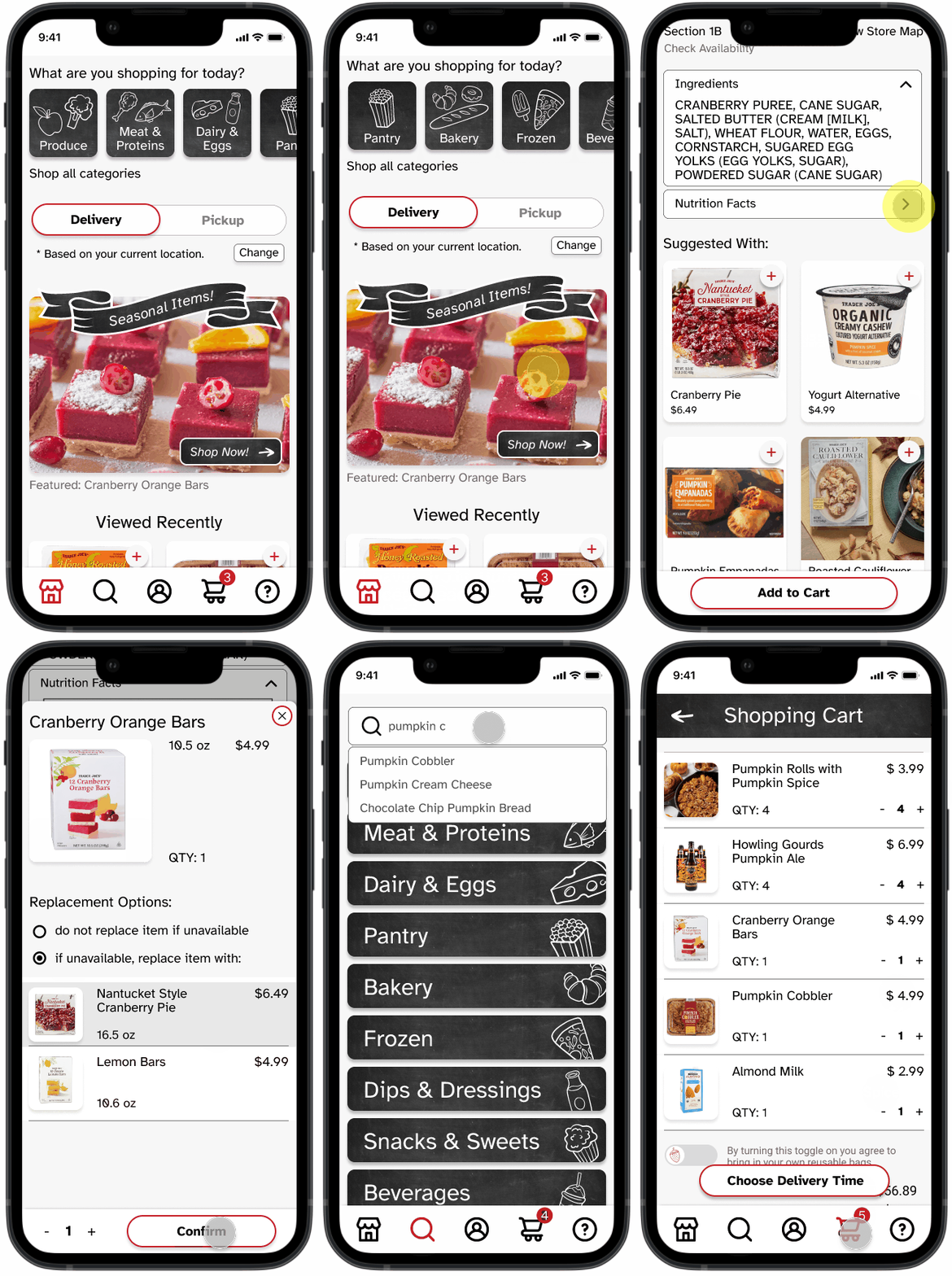
Mid Fidelity Screens


Testing Round Two
- Nine Testers -
Feedback:
-
Eliminate unnecessary pop ups.
-
Modernize design:
-
Eliminate hibiscus motif
-
Remove textured background
-
Simplify "Track my Order"
-
-
Decrease size of header and bottom nav bar.
-
More defined text hierarchy.

Iterations
Style + Iterating + High Fidelity Prototypes
Style Guide
Accessibility was our main focus throughout the development of our UI. We stuck with black text on a white background and used the typeface Atkinson Hyperlegible, which was designed for readability. We focused on simple iconography throughout the navigation, which we also brought into our product categories for quick and easy recognition. We retained the red branding color used in the Trader Joe's logo, but used it only in buttons and when addressing a call to action.
Choosing a style direction required some thought as Trader Joe's embodies a number of aesthetics. Take a look at their website and you will find an artsy old world quality through sketch like illustrations and use of natural colors and textures. Mosey through their stores and you'll notice a slight nautical theme and their employees donning Hawaiian flowers on their shirts. But one thing that has always stood out to me is their use of vibrant chalk displays to promote products throughout their stores.
We wanted to acknowledge the in store shopping experience, while keeping with a clean and modern, yet timeless design. We incorporated a bit of chalkboard texture, where we used fun food illustrations to aid in quick recognition for product categories and allude to the chalk artwork on display in every store.

Iterations from Mid to High Fidelity
Through our mid fidelity designs, we played with a paper-like background that reflected the natural textures in the Trader Joe's website. We also tried incorporating their signature hibiscus flower in the splash screen and throughout some micro interactions. We decided to steer away from these designs, take a clean approach, and introduced texture through the chalkboard elements.
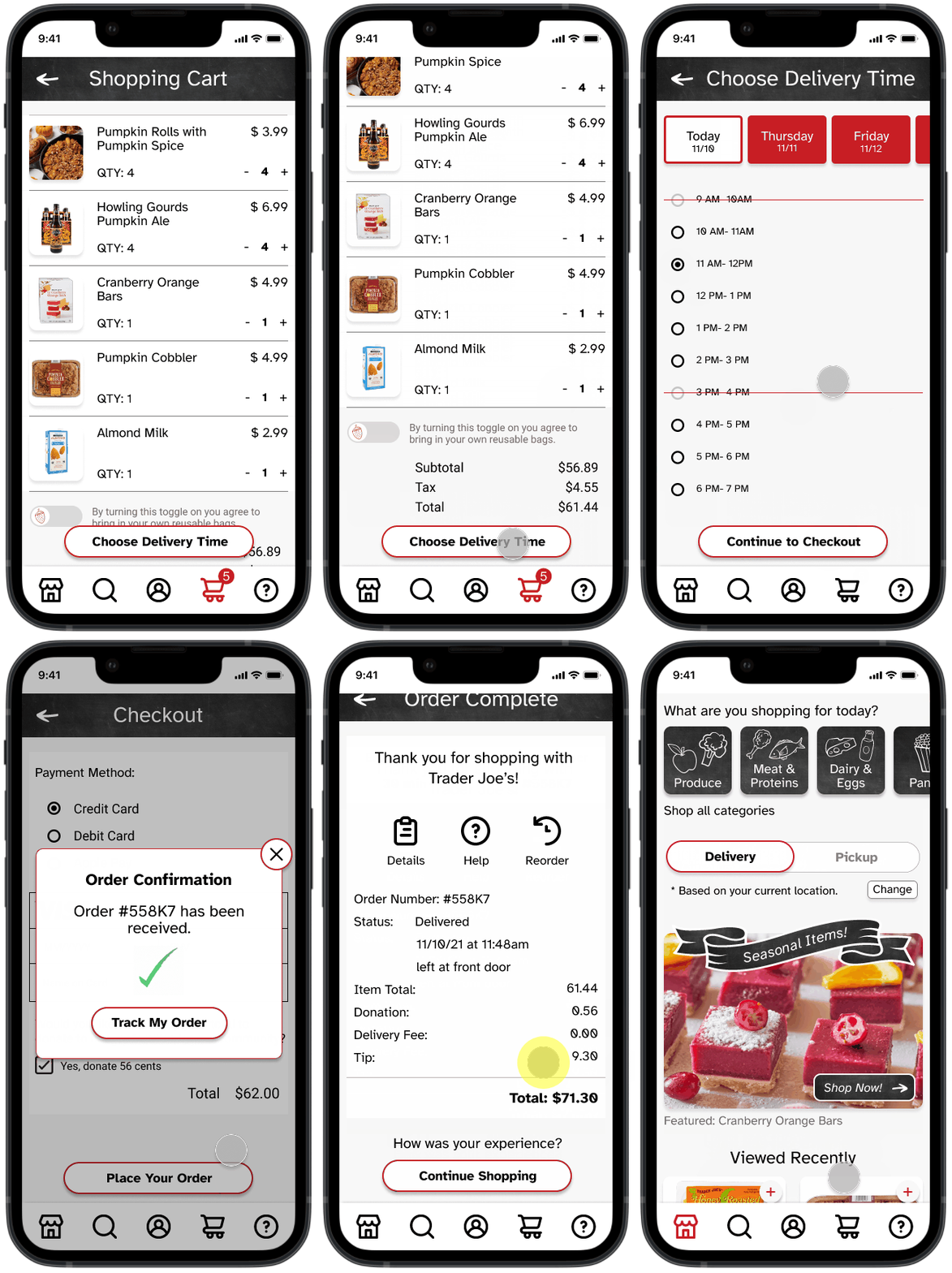
Shopping Cart
Key Changes Throughout:
-
Remove textured background
-
Remove bulky header
-
Remove labels on navigation bar
-
Remove heavy drop shadow
-
Improve type hierarchy and spacing
-
Simplify the display of information


Our mission was balance.
We needed to make sure the screens were easy to comprehend, while providing additional information that was just as easy to locate (and even easier to add to your cart).
Employee Orders


Shopping

Checkout

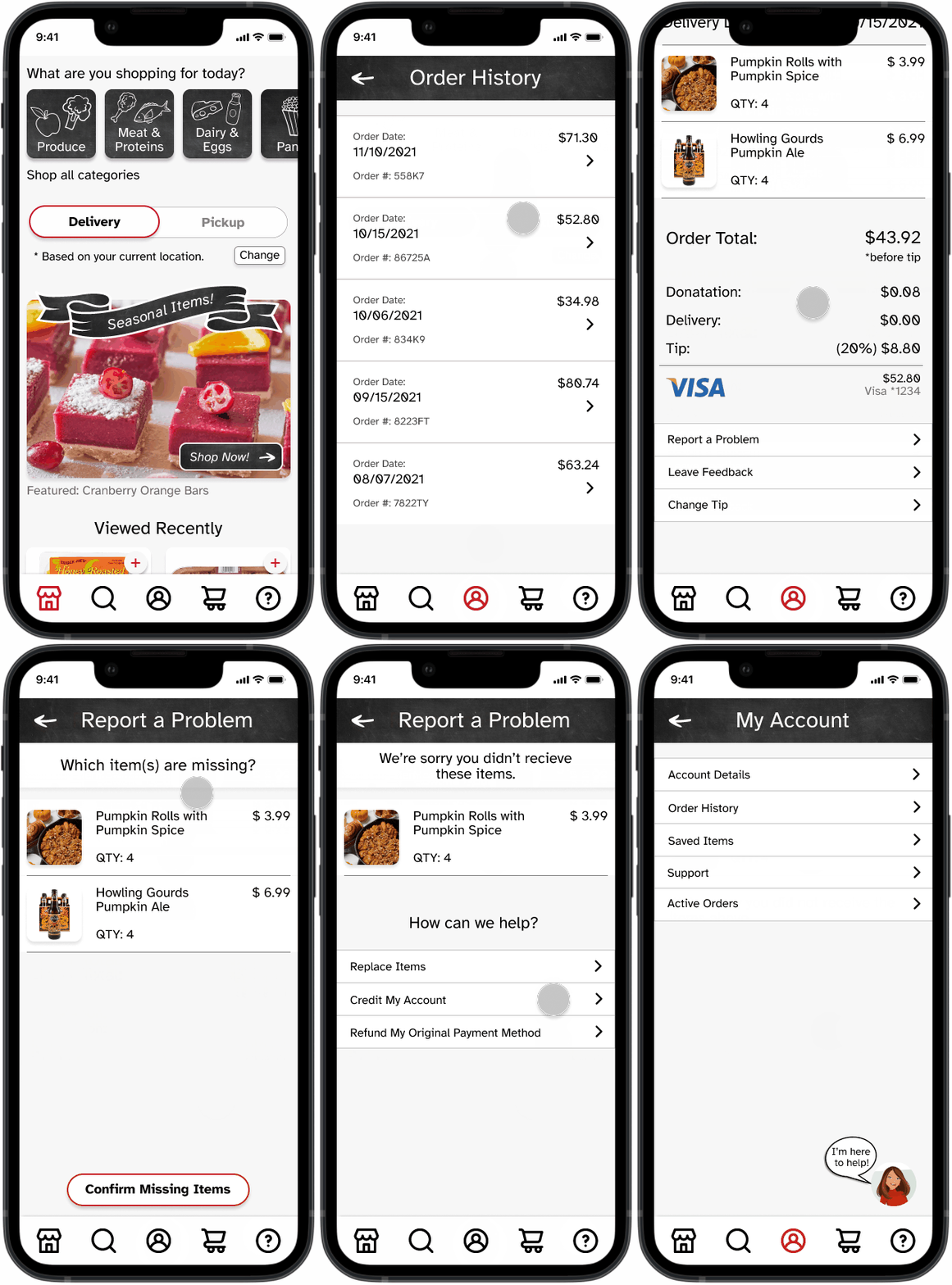
Report a Problem

What are the benefits of a
Trader Joe's Delivery App?
Consumers:
-
Customers with transportation or mobility needs can access products.
-
People with little time can complete an order from any location.
-
Receipts and order history are stored for easy reordering.
-
Customers can chat with their personal shopper ensuring their order is exactly as planned.
KPI Tracking
-
Increased Sales
-
Increase in App sign-ups
-
Higher customer satisfaction rate
-
ability to rate customer experience
-
-
Repeat customers
Trader Joe's:
-
Grow customer base
-
Increase sales
-
Reduced crowds in small stores and parking lots
-
Shorter lines
-
Stay relevant and competitive with other grocery stores


