Fences for Fido is a non-profit based in the Pacific Northwest. They provide fences, dog houses, spay/neuter and emergency veterinary services to low income dog owners.
My team was tasked with redesigning the Fences for Fido website in two weeks, with a goal of increasing donations and streamlining the volunteer sign-up process.
Fences for Fido
One fence,
one family,
one dog at a time...

PROBLEM STATEMENT
The Fences for Fido website is outdated, disorganized, and displays no clear mission, leaving potential donors and volunteers to feel disconnected and confused.
The Solution?
By clearly displaying their mission, reorganizing content, and creating a fresh environment, we believe we can bring in new donors and volunteers who will be excited to support their cause.
Role:
I worked alongside three others
to gather research, strategize,
and form design systems.
I spearheaded the navigation system, prototyping, and interaction design.
Tools:
Figma, InVision, Miro,
Adobe Illustrator
The Process
Empathize
Ideation
Testing
Iterating
Prototype
Empathize
Survey + Insights + Observations + User Persona
Research
We gathered survey results from 43 participants about their willingness to work with non-profit organizations. 41 of 43 participants expressed that they have experience working with non-profits.
why?
77%
Helping others was the most common motivation for wanting to get involved.
how?
56%
Most participants would rather make a financial contribution or donate items over volunteering time.
why not?
52%
40%
Not enough time and lack of knowledge about the organizations are the biggest reasons for not volunteering.
Interview Insights
We interviewed five individuals about their experiences with non-profit organizations.
Interviewees want to feel connected to the cause they are supporting.
There is a desire to help others either financially or by donating time.
How to get involved is not always clear.
Motivators include new social interactions, learning a new skill, and helping their community.
I know I should volunteer my time more, but I would rather donate money to help out… It would be nice to know that my money is making a difference though.
Observations
In both our survey and interview process, we asked individuals to rank their understanding of this website based on the home page. The majority responded that they did not know the purpose of this website and would have to dig deeper into the menu to find out, making this our first major pain point.
Heuristic Evaluation
Mission statement is not clear or easy to find.
No real color scheme or brand identity.
Overwhelming dark background.
Light blue text on dark background does not pass accessibility testing.

A
B
C
D
Too many categories with redundant links.
A
Missed opportunity for meaningful imagery.
B
Flash Player plugin no longer working.
C
Homepage dedicated to COVID information.
D
User Persona
Our user, Hannah Gabriel, is a dedicated vet tech who just started her career the Pacific Northwest. She wants to make new friends and fill some of her free time helping a meaningful cause. She has heard of some local non-profits, but wants to have a deep understanding of their mission before dedicating her time or money. With her busy work schedule, she'd like to be aware of future volunteer opportunities.
Nice to meet you,
Hannah Gabriel
Age: 30
Occupation: Vet Tech
Location: Portland, OR
#getoutside
#pnwonderland
#gooddogpdx
Goals & Needs:
-
Wants to get more involved and give back to the community.
-
Wants to help pet owners and provide safer homes for dogs.
-
Feels fulfilled by meaningful work.
Pain Points:
-
Busy with work and pets at home, but wants to make time to volunteer that will fit in her schedule.
-
Unsure about qualifications for volunteers or required skills.
“There is no exercise better for the heart than reaching down and lifting people up.” - John Holmes


Ideation
Information Architecture + User Flow + User Scenario + Sketches
Card Sorting
We conducted five card sorts, in which there were three main recurring categories:
-
Donate
-
Volunteer
-
Information about the non-profit


Redesigned Site Map

From these results, we concluded that most of the pages could be organized under four main categories:
Donate
Volunteer
Our Story
More Info
The original website had seven dropdowns that were disorganized and redundant.
By adding a subcategory of Volunteer Resources, and a Media section under More Info, we were able to greatly unclutter the sites main navigation.
User Flow
Now, we know our users are going to want learn more about the organization, easily find and sign up for volunteer events, donate, and learn of other ways that they can support. This is what we focused on here in our User Flow.

User Scenario
Lets meet back up with Hannah on her journey...

Sketches
When starting with our sketches, we focused on these Donate, Volunteer, and Our Story sections. Since these are the main focus for our users, we wanted to make them accessible, not only in the navigation, but calling attention to them throughout the home page as well.


Testing
Wireframes + Prototype + Testing Plan + Feedback
Low Fidelity Wireframes
Mobile Wireframes


Desktop Wireframes


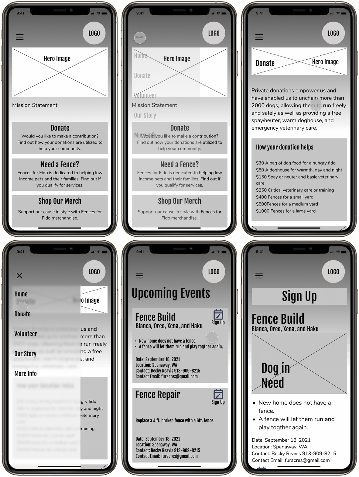
Lo-Fi Mobile Prototype
The biggest change in our redesign involved the navigation system. We condensed & reorganized the content in each category so there was no longer a need for extensive dropdown lists. We also made the most important information accessible right from the homepage. This restructuring of content translated easily across mobile and desktop.

User Testing
The Plan:
We conducted five user tests using our lo-fidelity prototypes.
Our main objectives of these tests were to discover:
-
If the mission of the website is clear to the user?
-
If the website draws attention to donations and volunteer events?
-
If it is organized in a way that is easy to navigate?
We gave our testers three tasks to complete:
-
Make a Donation
-
Sign up for a Volunteer Event
-
Shop for Merchandise
Feedback & Findings
Overall our users responded positively to the layout and flow of information for both the mobile and desktop sites. Testers easily found the donations and volunteer pages from the homepage as well as through the main navigation.
As testing goes, our users revealed some sticky points that gave us a solid starting point for our iterations.
Feedback:
-
It was not obvious to our testers that the Fences for Fido logo was the home button.
-
Testers thought they should be able to make a donation from the main donations page instead of navigating to another page to initiate the process. We agreed that this would help in creating a call to action by allowing the user to commit from the main donations screen.
-
The small "Sign Up" button in the top corner of the volunteer event cards were overlooked. Testers did not notice these sign up buttons right away and were confused on how to continue. The event info was also spread out over a couple screens, which became redundant.
-
When asked to shop for merchandise, some users recalled that it was featured on the home screen, but had a hard time finding it in the navigation menu.
Iterations
Iterating + Design + High Fidelity Prototypes
Iterations in Mid-Fidelity Mockups
We considered all of this feedback moving into our mid-fidelity prototypes and feel that we were able to simplify the structure of the site even further. Below are some of the impactful revisions we made to some of the desktop screens based on our testing sessions.
Added "Home" tab next to logo

Added "Store" button to main navigation
Created a call to action on the donate page


Simplified volunteer Sign Up process
Consolidated Event Info
Mood Board & Visual Style
Our goal was to brighten the feel of the website. We wanted to energize potential donors and volunteers, inspiring them to get involved. We chose colors that would feel fun and inviting, and used rounded edges and organic shapes to soften the experience.


Design Evolution
Easily one of the most enjoyable parts of working on this project was collaborating creatively with my teammates. This design evolution culminated after a nearly five hour design power session over Zoom. We were able to work through the rough patches of our initial style choices, allowing us to identify what was and was not working in our design.
We were originally working with some very bright colors that we quickly realized were overpowering the site. We nixed the bright blue and replaced it with a deep navy to ground the screens. We decided to keep the bright green, but reserved it for creating our call to action moments.

Animations
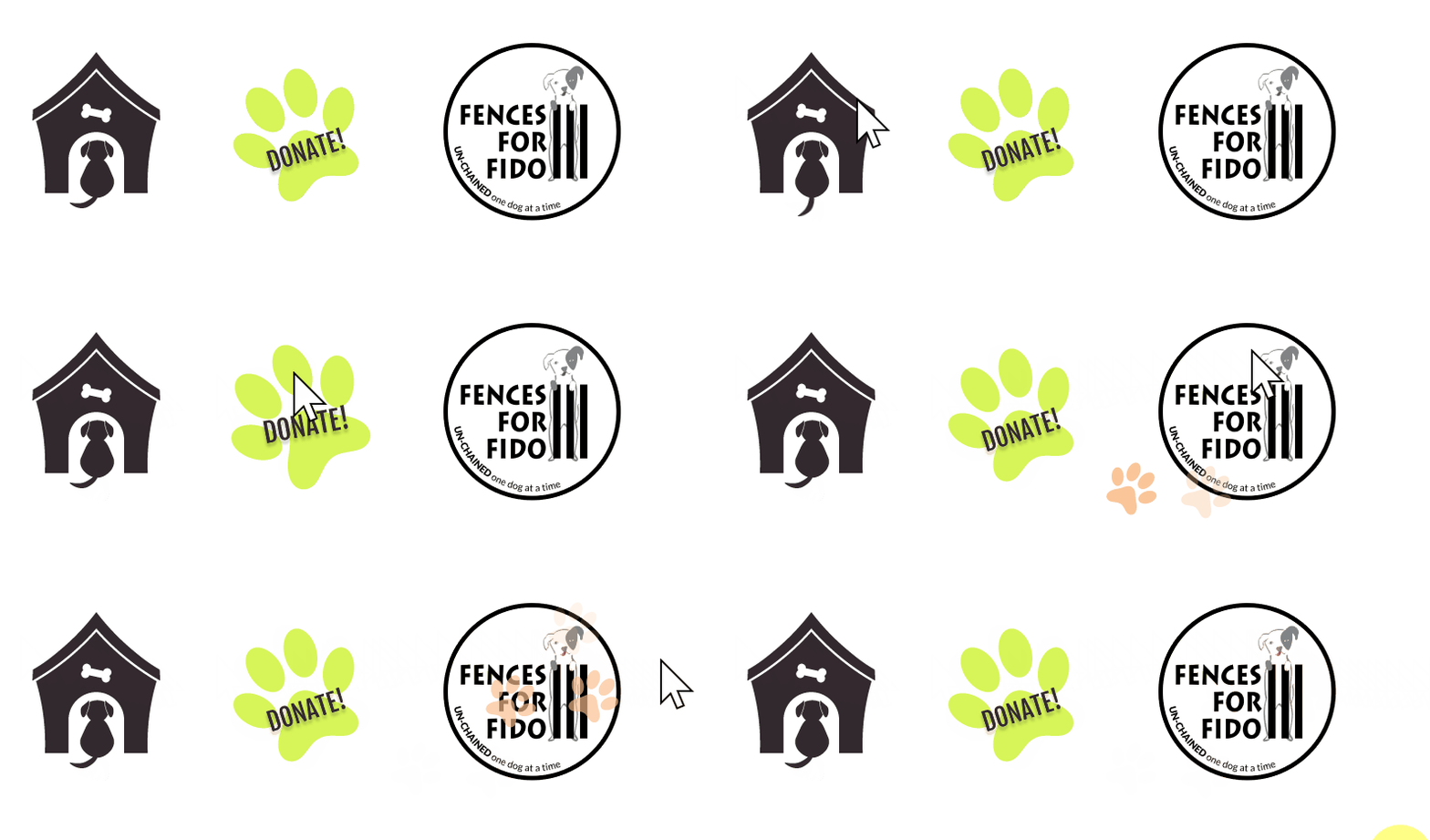
My favorite part of creating design systems is developing the UI's personality through animations and micro interactions. I also have a lot of fun designing navigation systems. It was pretty easy to get carried away with this website, so we kept the design clean with a few meaningful, delightful interactions. Below are are few of my favorite hover interactions, along with a little snip featuring the navigation bar.


Final Thoughts & KPI's
Our team members were inspired by the dedication of this non profit to the betterment of life for their communities’ pets. This project presented the challenge of not only creating a visually appealing design, but also one that inspires people to contribute through Fences for Fido.

Next Steps
-
Conduct new user testing on High Fidelity design.
-
Reiterate based on testing results.
-
Launch new responsive website design.
KPI Tracking and Goals
-
Higher average in amount of donations per month
-
Increase in volunteer sign ups
-
Increase in repeated donations/volunteers
-
Increase in store sales


